
Feb '24 CPI: Another Worrisome Release
- CitizenAnalyst

- Mar 12, 2024
- 4 min read
February 2024 CPI again came in hot, though economists and market participants were a little more prepared for that this month than in January. February's figures were as follows: +0.4% increase for both the headline and core indexes, on a seasonally adjusted, month-over-month basis. This was generally in-line with expectations, though a little worse versus expectations on the core. Unrounded, the core was up roughly +36 bps (0.36%). On a year-over-year basis, headlined CPI increased 3.2% (a slight tick up vs. January's 3.1% Y/Y increase), while Core CPI (which excludes food and energy prices) increased 3.8% over the last 12 months, a slight improvement compared to last month. As a reminder, the Fed's target is 2% on an annualized basis, so most of these metrics, whether annualized or taken at face-value, are too hot.

If last month's print looked worse under the hood than an even bad headline indicated, this one probably looks a tad better. That being said, the fundamentals from this release still are about as bad as they've been in a year, which is not what we want to see. Let's go through some of the details, as we always do.
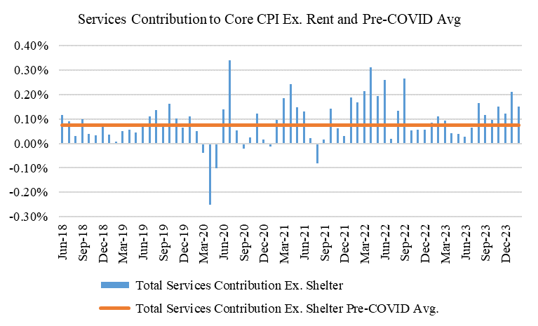
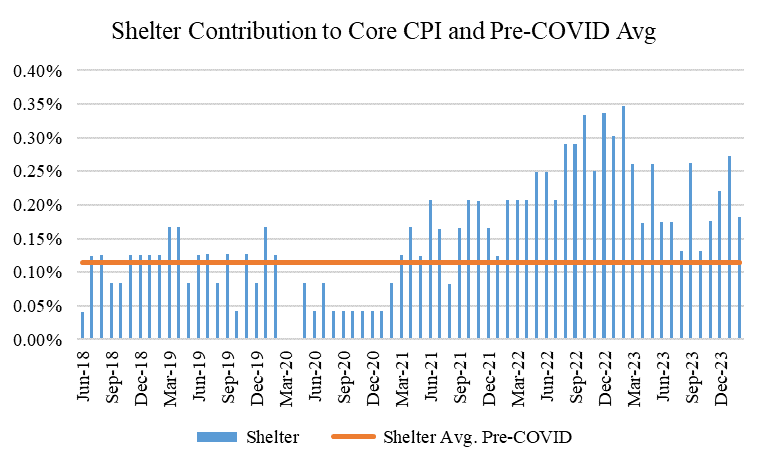
First, looking at inflation in our three buckets, we see the following: goods contributed +2 bps this month, generally in-line with its recent and pre-COVID averages of about 0 (indicating goods prices, on a seasonally adjusted basis, continue to remain about flat). Services ex-shelter contributed +15 bps for the month, almost double the pre-COVID average of +7 bps. Finally for shelter, that bucket contributed +18 bps, also above the pre-COVID average of +11 bps. As all the charts below indicate, all three of our buckets this month are on the wrong side of the pre-COVID trend line again this month, with services ex. shelter and shelter meaningfully so.

One positive from this month's release, however, was the retracement in shelter. While it's still notably on the wrong side of the trendline, one can pray that perhaps this is the start of the CPI Shelter index catching up to market rents (which continue to indicate rent growth has cooled off considerably, to about zero). Those prayers to date have been unanswered, but hopefully the inflation gods will begin to oblige us soon.
Another way to show this is to look at the underlying monthly growth rates in both goods (including and excluding automobiles) and core services (both including and excluding rent). Both charts here corroborate the charts above, though the services chart (similar to the one above) is more concerning.


Let's now look at deeper category level data. As a reminder, we like to look at what we call "Category 4" and "Category 5" level data to get a better sense of what inflationary breadth looks like. If more categories are inflating at levels above the Fed's target, then it's easier to make the claim that inflation is re-accelerating. If that's not happening (as it wasn't for the better part of the last 6 months), and the indices are being driven by fewer categories, then that's a different story. Unfortunately, inflationary breadth does appear to be picking up (at least according to the CPI, but more on that in a minute). As a reminder, Category 4 level data comprises 55 goods and services baskets that make up about 98% of the core CPI, whereas Category 5 level data comprises 101 goods and services baskets that make up about 78% of the core CPI index.


Both the average and the median for this month for both Category 4 and Category 5 level data was 0.30% on the median and 0.34% on the average. This is slightly better than last month, but still considerably worse than where we were late last year. Annualized, these figures imply about 3.6% inflation, which is well above our 2% target, and also well above where the category level data had been running for months.
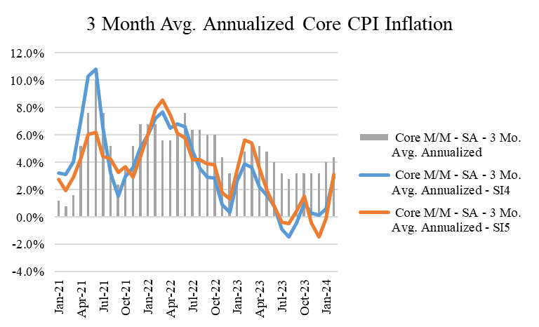
Now here's the three month averages, annualized, for both the core CPI index and three month averages for our "Category 4" and "Category 5" level indexes. While the lines remain below the bars, the trendlines here look even worse, and also suggest inflation has picked back up to a rate closer to 3.5% over the last three months.
Lastly, here's a chart of how core inflation looks on a 1, 3, and 6 month annualized basis. Looking at these shorter term measures allows us (and the Fed) to extrapolate data points with a term of less than twelve months to get a sense of where a "run-rate" of annual inflation currently is in the economy. Notice what appears to be a general trend higher since last September in these lines. This no longer looks like the "bump" that we were hoping for last month. This too suggests inflation at the moment is probably well above where we'd like it to be (a meaningful change from later last year).

While all of this looks and sounds discouraging (and it is), there is one major caveat here, which is that the CPI appears to be the only inflation data that is reporting this notable re-acceleration. Unfortunately for us, it's the most important inflation data, but in the post-COVID world, where survey response rates continue to be weak, corroborating data points from a variety of sources is imperative to get to a fair conclusion about the state of anything in the economy (this is particularly true for the labor market). Perhaps most importantly, companies generally did not corroborate a re-acceleration in inflation so far in 2024 on their 4th quarter earnings calls (for either prices or labor). If anything, companies seemed to indicate inflation in the real economy continues to get better so far in 2024, not worse, making the CPI releases the first two months of the year all the more perplexing. Because of this, I'll be back soon with a "State of the Union" inflation report away from CPI to give us a sanity check on how right or wrong January and February's CPI might be.
Talk to you all soon.


Comments