
Nov. CPI: A Step in the Right Direction, or Stuck in the Elevator Down?
- CitizenAnalyst

- Dec 12, 2023
- 7 min read
November's CPI came in about as expected, with headline prices increasing by 0.1% month-over-month (seasonally adjusted) and core prices increasing by 0.3%. Unrounded, the core increase was 0.26%. Year-over-year, headline CPI was up 3.1%, while core rose 4.0%. Below is a table summarizing these figures, along with 3 month averages, as well as a 3 month average of the core CPI, annualized to a 12 month rate (which allows us to compare 3 month figures to the 12 month year-over-year figures). It's this last item that the title of this post references, which is, are we stuck around 3% inflation? I'll argue the answer is no, but we'll come back to that later.

Let's first go through our three buckets, as we usually do. Goods contributed -7 bps this month, while core services ex. shelter contributed +15 bps. Lastly, shelter contributed +18 bps. There's a few things to call out in detail for each bucket, so we'll turn to that next.
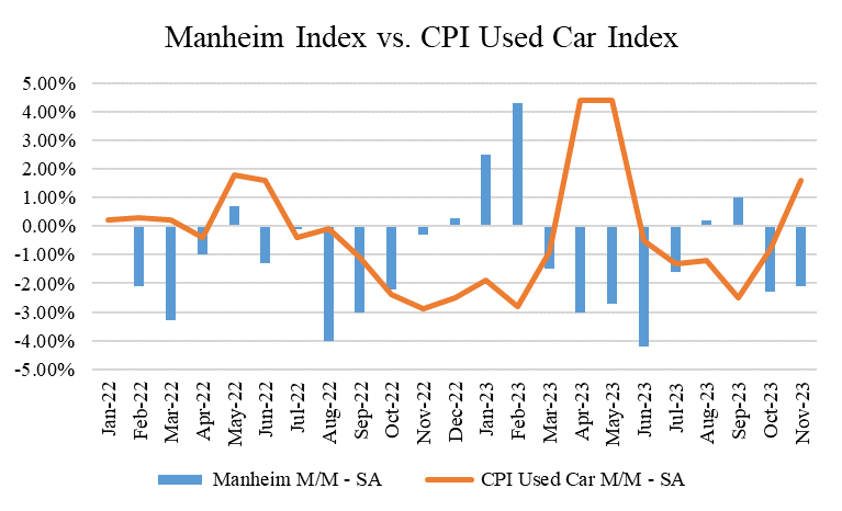
On the goods side, the category was generally very supportive of broad disinflation, especially considering used car prices actually contributed a positive 5 bps to the overall core inflation number. This was the highest contribution since May of this year for this category. Excluding used cars (which we can feel comfortable doing because several market based indices continue to indicate that used car prices are falling, not rising, see the charts below), goods were actually nicely de-flationary, contributing -12 bps this month. This was the best month for goods Ex. Cars since April of 2020. Additionally, category averages for goods was also nicely deflationary (-0.56% including cars, and -0.66% excluding cars), indicating broad price pressures downward for goods across categories. This would be in contrast to significant moves in a few goods categories driving the whole goods bucket down more generally, but this is not what's happening. This is all great, and for those of us who still have holiday shopping to do, this should limit the damage for procrastinating.

Now here's a chart showing the average monthly price changes for goods, both including and excluding cars. As we called out above, this month's figures were -0.56% including cars, and -0.66% excluding cars. This contrasts with the chart above, which shows the contribution from goods to overall core inflation, rather than the average monthly price change. These kinds of price declines are probably not sustainable, at least not quite to this magnitude, but we'll have to see. As a reminder, Sub-Indent 4 in the chart below refers to 55 baskets of goods and services that comprise about 98% of the core CPI. In this particular chart, we're just looking at those baskets that track goods.

Now here are the market-based used car price charts I was referring to above. Downward pressure in the used car market continues, so given the CPI tends to act with a lag here too, the downard trajectory for used car prices in the CPI should continue in coming months as well (note that most of these charts reflect wholesale price changes, whereas the CPI looks at retail price changes, which is what you and I pay, so consequently the CPI tends to lag Manheim and Blackbook by a couple months).


Now let's turn to the core services side of the house (aka "super core"), which excludes shelter. As you can see from the chart, this figure was high again, but this was generally driven by continued upward pressure from transportation services (which includes car insurance). While insurance itself only contributed +4 bps this month vs. the +7 bps last month, this number is still significantly above its basically 0 bps monthly contribution pre-COVID. As we talked about last month, this is higher because of the lagged effect from higher used car prices during COVID (as used car prices go up, it becomes costlier for companies to insure them, as you would imagine). Below are charts showing the monthly contribution from both Medical Care Services and Transportation Services, and then specifically car insurance. Medical Care was higher than "normal" this month, but not meaningfully so. It's worth showing the chart there as a refresher given how important healthcare costs are to the economy, and to each one of us (whether directly or indirectly). Sadly, there's not much to point to that suggests Medical Care inflation will be any better post-COVID than it was pre-COVID, so it's categories like Transportation Services that are worth looking at more closely. As it turns out, that continues to be the category that's pushing "super core" higher, and also the one that has a good chance of eventually slowing down and reverting.


There is some very solid good news within core services, however, and that's that inflationary breadth is cooling here. Contrary to what you may keep reading in the press about "sticky services" prices, we're actually seeing many, if not most, services prices inflate at rates below their pre-COVID averages. This again helps substantiate our notion that "super core" services are being mostly driven by a few categories, rather than a broader swath. Notice both the bars and the line in the chart below are generally below where they were pre-COVID.

Now let's lastly turn to the shelter category. Shelter continues to be a bugaboo category as well, as we've been hoping for continued reductions in rents in the real economy to make it through to the CPI by now. To date, this hasn't happened as expected, but as we'll show below, multiple different market rent trackers are in fact continuing to show progress, so there's reasons to still be hopeful here and not feel delusional about it.

Here are two market-based rent trackers that hopefully sanity check what I'm saying. And here are links to each in case you want to investigate for yourself: https://www.realtor.com/research/october-2023-rent/ and https://www.apartmentlist.com/research/national-rent-data.


Given what we've said about market rent prices and the lag between insurance and used car prices, both should come down over time. An insurance person I spoke with recently said this could take longer than we think though, and you may not see the pressure on car insurance (downward) really start to show up until 2025. Perhaps not surprisingly, everything post-COVID has taken longer to revert than we think, but while there's still plenty of reason to think they will, rent and car insurance are really bringing up the rear now.
Let's show some other charts to try and provide some perspecitve for where we are in the inflation battle. This first chart shows 1, 3, and 6 month core CPI figures, annualized. The one-month, as you'd expect, moves around a bit. 3 month and 6 month have now converged around 3%. Does this mean we're stalling out? The answer again appears to be no.

Here's why. If you look at what's happening with most categories, both on the goods and services side, they've been around 0% for the better part of this year. 0% means their prices aren't increasing (or decreasing) at all. As we've said now several times, this again helps demonstrate that reported inflation figures are being held up by several categories, with rent being the most notable. Notice how far below the bars the lines continue to be. The lines represent category averages, whereas the bars represent the weighted core index. The gap between the two is being driven by categories with large weightings (like shelter) taking longer to normalize.

I've been saying for some time that we're probably much closer to 2% inflation than we realize, so given a lot of these moving parts, let me give you a little more detail into how I get there. This will also serve as my best estimate for where underlying inflation is in the real economy today (which I think is about 2.3% or so).
To do this, I do three things.
First, I look at goods price trends excluding used cars. Note that this has actually negatively impacted my "run-rate" inflation estimate of late (meaning it's made it higher than it otherwise would be compared to if I included used car prices), because used car prices have been falling (it was only this month where they were inflationary for the first time since May). Said differently, if I included used cars in my estimates for "run rate inflation," it would be even lower than what I'm going to show you.
I then take the reported core services figure, making no adjustments to try and normalize any category. I simply use those monthly numbers as is.
Lastly, I take shelter, but I do normalize this given the dynamics we just talked about above. As a reminder, the way the CPI calculates shelter can be understood by looking at an apartment complex with twelve apartments, each whose leases were signed in each month of the last year. Most people think about market prices as the change for the incremental person renewing their lease. For example, if the person renewing their lease for Jan. 1 just saw a 3% hike, then most people would say rents are increasing by 3%. The way the CPI does it, however, is they only count this rate at effectively 1/12 of the weight. Said differently, if rate increases for all our neighbors in Apartments 1-11 were higher than 3%, we'd have to wait 11 months for the CPI to show rent in the building as actually being 3%, simply because that's how long it would take for everyone else to renew at the new 3% rate.
Because of this dynamic, I use the pre-COVID average, which again likely actually overstates real shelter inflation right now given rents are inflating at below average levels. So this is by no means cherry picking and unfairly massaging the data to get to a desired outcome. Here's how this looks in table form, and then I'll give you a chart. The above four lines in the table show the monthly contribution from each "bucket" with the adjustments (if they are actually adjusted) to each called out above. The bottom three lines then show those figures on a one, three, and six month basis, all annualized (so for one-month, you'd take 0.15% x 12, for three months, you'd take 0.15%, 0.22%, and 0.21%, average them, and multiple by 12, etc.)

Now here is the chart. Notice how all three lines--1 month, 3 month, and 6 month--have all converged just above 2%. This tells us that we're much closer to our 2% target than we think. There's always noise in data, but this is my best guess at where we are today.

In conclusion, November's CPI data actually provides much more evidence of the progress continuing than it does that progress is stalling out. Inflationary breadth continues to cool, both on the goods and services side. We just have to be patient for the lagging categories to show up in the actual CPI data itself. Time will tell when that happens, but I still think this will be a question of when, rather than if.
Given this is the last inflation report (released) in 2023, for those of you who find your way to this blog for these posts specifically, enjoy your Holiday and have a fantastic New Year!


Comments